Planning, Production & Practical

When planning I hope to be able to forge an interesting and inspiring idea by keeping it to a finishable level and not giving myself too much practical work but making a well-executed product. so far I'm very unsure what I would like to do as I want to go into "uncharted waters" but I also don't want to go into something that I wouldn't be able to accomplish while learning and doing work at the same time.
I want to get into using blender more but I'm worried ill take too long making anything as I have to research all of the new software mechanics.
This is where you will see the planning of my project and see the weekly updates of what practical I'm doing to construct my idea and making the final product.
Gantt Chart Timeline

This is a Gantt chart which displays what id like to be making sure that I'm doing throughout the weeks. this will undoubtedly change with errors and extra time spent but it helps me stay on task
Contingency Plan

a diorama is pretty self-explanatory but there are many ways I could do it, would be a case of finding an environment I like and thinking of how many assets would be needed so that it's finalised properly within my time limit, An example of this would be a forest where I'd need to make foliage especially leaves which would be very time-consuming unless I found a way to make a more cartoon design or some sort of procedural technique. of all of these options, this would be the one I'm least proud of as it's just an object and my last final project was technically an interactive diorama.
Diorama
The Big Three
Character design was one of my favourite things to do when doing 2d art, I was doing it since I was very young and it still interests me now.
the thought of creating a character that's supposed to fit into an environment and game is what I like most as I have to make creative decisions to make sure they're designed for what their purpose is.
I have little to no experience making a person in 3d software so I think I'd have to make some sort of fantasy character mostly covered in armour or is just a robot as I know ill take too long trying to make the face and body look good.
I'd also like to go into a higher poly design style if possible as I'm somewhat bored of low poly. I love the look of low poly but I believe I need to get some true experience in higher poly as that's more accepted in the industry.
Texturing would be very important as I need to improve my experience and I want to make the final product as finished as possible.
Character Design
I'm unsure what the animation would be themed as or what would be in it but I have a few ideas, of the simpler ideas would be an environment with moving features, examples would be a night city with cars travelling the roads from a birds-eye perspective.
An idea that I would love to make but would probably be an overstretch would be a combat sequence between two characters. I would most definitely have to downloads models or make very simple stick figures and focus on the movement and effects from the battle.
I'm very fond of the style used in Japanese anime to show the power being the strength of the weapons and characters. to do this correctly I would have to draw it in 2d but I have some ideas on how to make this work, as I have little to no experience in drawing digital 2d art.
I could also make some other animation style like a reel of animations that would be added to a character in a game like a walk, attack, and jump animation
Animation

Animation
The reason I picked animation over the other options is that I would really like to refine my skills in an area that I've explored but not executed in such a way as this. I am unsure of the style just yet but I'm sure it would either be detailed realism or maybe cell-shaded like an anime style.
Id like to make a short animation about a character doing a finishing blow on an opponent or object using a katana. I’ll most likely take great inspiration from certain anime titles such as demon slayer.
This would only be a few seconds long, but I’d make sure it’s as visually pleasing as possible. I would like to go for quality and not quantity
There would be a lot of set up as that would lengthen the animation overall and add suspense and build up.
A great thing id like to focus on as well to add to the piece is making sure the audio is as crisp as I can make it while fitting perfect with the animation. I’m not sure how I’d get the sounds so ill most likely get some free samples of thunder and maybe music.
For the final scene after the strike is made id like to animate a very intense thunder strike viewed from a far distance to show the level of power the character possesses. This would be made in 3d, but the effects may be drawn in if I can’t make them in blender/3ds max.
The purpose of this piece in terms of the games industry would be a cutscene or finishing move of sorts, similar to a "fatality" in mortal kombat. I feel this is a useful type of media to practice as it can be utilised in many ways in this industry and more.
My reasoning for this decision is I really appreciate this style of animation showing great power visually.
I believe I can make this as I have experience animating simple movements from previous projects and that’s what this will consist of. The length of the animation would also mean I have plenty of time to focus on the essential parts to make sure it’s the best quality possible
From previous projects I’ve given myself too much work every time so I feel having something so simple would have a good satisfying outcome.
I would have to focus a lot on texturing which I want to build knowledge on.
A PowerPoint pitching my current idea to the class. most of the details will be displayed on this site.
Pitch Powerpoint
Storyboard

This is my storyboard for my animation. this may change as this is my first draft and I'm unsure what I'm capable of in blender yet. when making the final product I will provide updates for changes to each frame to what has changed to be done to produce this outcome.
Katana Construction

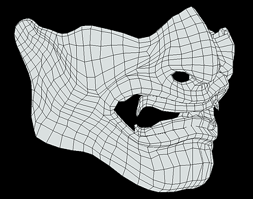
I have started modelling the katana, I'm using blender as I have found to prefer it but my experience level is much less than what I have in 3ds max so my progress is going to take slightly longer but It will hopefully be worth it with the quality of the product.
I haven't got any screenshots of making this first result but it's not really that complicated so far. it's basically an extended bent cube for the blade and a cylinder for the handle and hilt.
i then used an inset tool to remove a number of faces so I could give the effect on the hilt seen below.

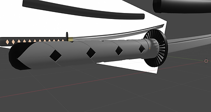

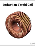
making the handle and hilt was the most complicated part along with texturing as all of the techniques and modifiers I used were almost completely new to me. making the hilt was tedious as it was deleting and replacing faces till I could get the "spoked" look. I went for this look as I thought it would look like it would greatly conduct electricity between the beams similar to a copper coil.


These are some renders of my renders for the basically finished katana. I'm happy with it now but I may want to alter it in the future.
I really like how it looks as it looks clean and refined, I put a lot of thought into the texturing by going through many options and making sure I got the right look to represent the professionalism of the blade.
Environment & Setting

this is a rough mood board of the environment I would like to make for my animation sequence. I thought about different ones but a misty woodland setting would relate to my inspiration.
one of the main reasons I wanted it to be night was so when the lightning and sparks are created it will hopefully make the visuals of the lightning pop a lot more. I also think that having a dark forest with subtle fog would make it easier to hide the "imperfections".


These are reference images taken directly from my inspiration which widely incorporates woodland environments. I would like to find a way to make the environment my own by changing some things. I'm not sure how I'll do this yet but I feel like my ideas will adapt and evolve during the practical process. I'm thinking at the moment about a fighting platform or some sort of artefact building in the background.
Making/testing assets for the environment
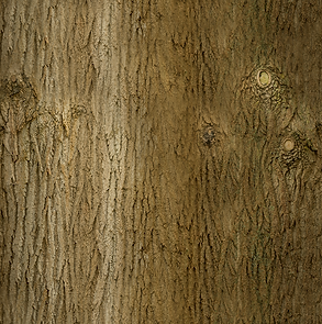
for making the trees I'm going for a more realistic look so I'll need to research more into the techniques used for achieving this design correctly.
after peer discussion and recommendation I came across a youtube blender tutorial which I used in order to make my own test tree as seen on the right in the screenshot. I didn't fully follow the tutorial as I wanted to mess with it slightly so I understand what the processes do and what they're for.


This is a render of my first attempt at a tree for the environment. i like how it looks but it is nowhere near as good as the tutorial I was following. I didn't follow it fully as I like to experiment with my designs and try to figure it out myself as the rewarding feeling of figuring it out myself helps me remember the techniques.
I now need to add the smaller branches with leaves which will probably be a transparent texture.
I'm not too worried about what the trees will look like as the dark and mist will cover the minute details. Although I will need to take into consideration when the lightning strikes and ambient lights it doesn't reveal unpleasing parts of the models.
This is my second tree, I can't say it is much better but I tried to vary the branches in terms of size and rotation. I will now be trying to add the branches


I'm kind of making my own leaf foliage texture as I couldn't find a premade alpha texture that I could download. so for this, I downloaded the coloured leaf texture as seen above and then used photoshop to create the alpha map making it easier to make the leaves look transparent. I will not need to make an object consisting of planes that are textured with this and I'll hopefully have a finished tree.

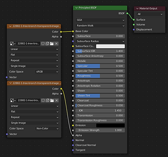
it wasn't hard to make this, all I needed was a plane and the 2 PNGs I have. I thought it hadn't worked correctly as the black from the alpha was showing through but that was only because my viewport was in material preview and not rendered which doesn't make sense but fixed my problem.

I have now duplicated the plane and rotated it in certain ways to make it actually look "3D". i will add some sort of noise so that each plane isn't dead straight.

I have added some of my foliage objects onto my first tree and it's starting to look quite good. it will take a while to cover the whole tree but I'm happy with how this is going. I will need to make a slightly different leaf object as I want the other trees to differ in a way.

Rocks
for the rocks, it's not too important but there are different types of rocks like limestone or some of the more sand coloured stones, for the environment, I would like to keep the background quite flat in terms of colours as the focus is on the characters.
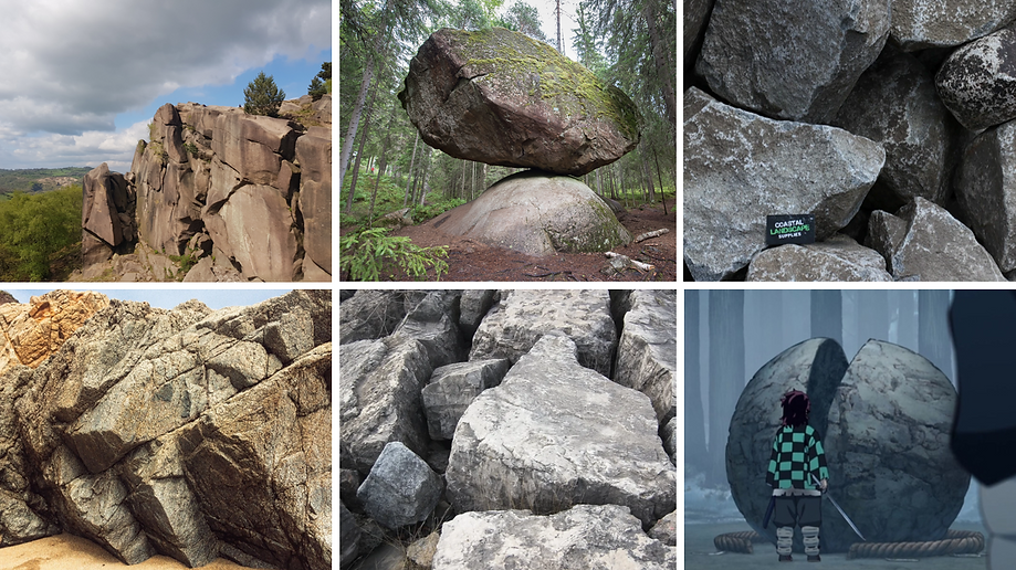


This is a practice of making a rock that would be in my environment. this is the first "realistic" rock I've made. I like how it looks as I used multiple techniques. the ways I did this was by starting with a sphere and using soft selection to sculpt it in a way, then I added a decent rock texture. after this, I wanted to add the weathered effects as seen in the reference images. I had to look into somewhat procedural texturing techniques. this texture type looks for extremities on a model and will place

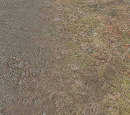
Ground & Geography
For this scene, I need to make a decently large environment so I need to put effort into making the ground and foliage look fitting for the scenario and make it pleasing to look at in these cinematic camera angles showing the area.
when showing the last scene with the huge lightning strike on the area will most likely need to make a secondary environment as it will be from a very far angle. it wouldn't make sense to constantly render this huge horizon if it's only fully shown in the last scene.
I haven't made a realistic environment yet in my modelling so this will be a great experience to develop my skills. Knowing how to accurately represent geographical scenes will be greatly important for future projects as showcasing your assets in a true scene is a much better way than some others, this is how I feel anyway, especially with the foliage and other natural items because it's weird to see a bush on its own for example.

When making the texturing for the ground, I followed this tutorial so that I could make the texture grid pattern less visible. The texture is seamless when placed in a grid but the colours make it obvious its a replayed texture

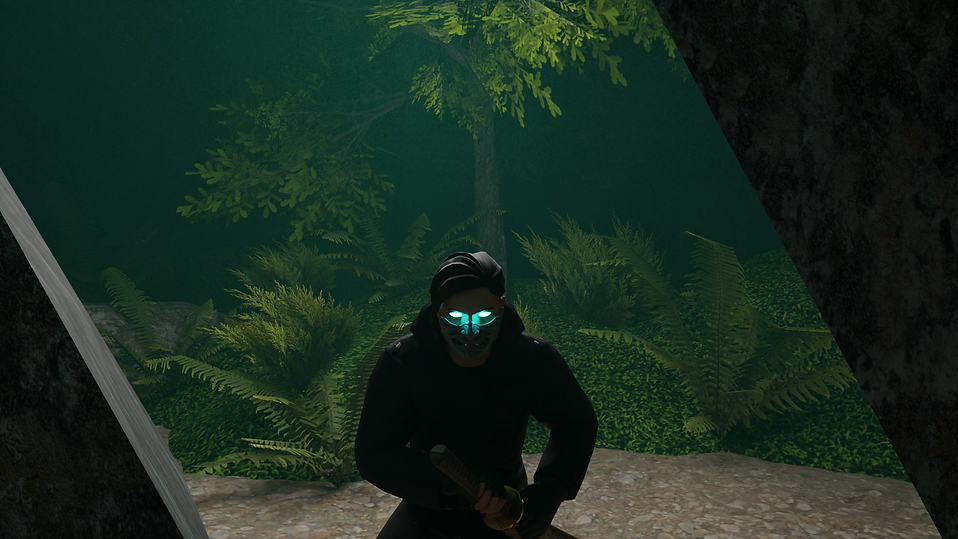
THE CHARACTER
I will not be able to make my own character in the time frame that I have right now so I will be using an asset I can find online for free that isn't copyrighted. I have had a look and have a few that I like and this one was the one that stood out for the kind of character I need, I wanted them to look like a relatable person but be somewhat mysterious. I plan to edit the character adding and taking away pieces if necessary. looking into this I didn't think about how simple this can be once I had downloaded the model and brought it into blender

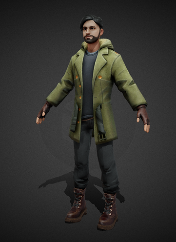

I added the mask because I wanted to remove the need to add emotion to the character
purely for practical reasons that it will take less time to animate as when animating you cant just animate one section of someone, you need to make sure that every hard of the character is moving at least a little. having a stationary mouth might take away from some suspenseful moments


THE GREAT CATASTROPHE
On the 26th, we came back from the Easter break and found that all of my blender work had been erased. during the break, the pcs had been updated, which had refreshed the downloads file. this wouldn't have been a large problem, as I am usually well organized with my files. although I should've been fine, I realized that blender doesn't like using one drive, so it was easier to keep my models in downloads as blender finds them on the PC and organizes them in the blender file searcher/ recent works.
this has greatly struck my motivation and my project's progress, as I obviously need all these assets for the animation. this would've been somewhat sealable if it were a "normal" project as most of my assets don't take too much effort, but in this project, I really tried my hardest to make the assets as detailed and refined more than I ever had before. the katana and rock were my proudest pieces to date. the rock was simple but got the weathering on the sides. I had to use texture editing using masks and colour ramps which alter certain areas of a shape, which is very useful for giving a weathered effect rather than doing it manually. this seems simple but it took me a long time to get it to look right. the katana was my favourite, while having somewhat simple poly work, the texturing really impressed me and others.
from this, I will need to download most, if not all, of my project assets using Turbo Squid and sketch fab.
I don't really want to do this but I would like to end this project with at least half of an animation.
another way this has affected me is I may have lost previous works from last year etc, this means all of these pieces lost cannot be practically shown on a portfolio and be able to be presented in a 3d view as I only have screenshots which don't give most of my pieces enough credit. There was talk of being able to retrieve old files but nothing was really accomplished and at this point, it would be a waste of time as I have already started compiling online models to replace my own
New Assets used
KIARASH 3D (@kiarash8585) - Sketchfab
denis_cliofas (@denis_cliofas) - Sketchfab
Márcio Meireles (@marciomeireles) - Sketchfab
Thunder (@thunderpwn) - Sketchfab
Constructing with online models

this was the model I used previously but I have edited it in ways I hadn't before as I wasn't happy with my original design before the "wipe". this hadn't affected me much, as the character wasn't mine whatsoever. however, I have altered the design by compiling multiple people's pieces to best represent the character I wanted for this animation. I have added a belt and a new sword-sheath, which I think has gone very well with the design.
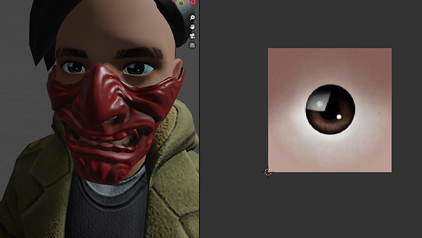
following my inspiration, I also wanted to make my character's eyes glow to represent the power the person wields. I had done this to my old model before the "wipe" which I also had the evidence screenshots in downloads, so I had to recreate the eyes using a custom eye texture off google which was more compatible with the texture editing I wanted to do. this uses a colour ramp which acts as a mask. which masked purely over the iris. using this mask, I could use to make only the iris emissive. I like this effect in the end and I think it will help keep the attention to the character rather than the poorly made environment, as the time going into the background has decreased even more since the work was lost

This character model came with a rig already which is extremely helpful, however, I had to edit it by adding bones/ parent nodes to the new pieces I have added otherwise they would be stationary while I was animating the head, for example, the mask would float away from the face.
all of these items I have added were all configured to tri polys which are needed for game usage but in animation it's not as needed and I prefer working with quads so I had to use a quick blender setting when selecting all the model's faces, this setting automatically configured the tris to quads which were extremely easy.


This is me showing the result after adding an "IK" rig to the pre-rigged character model. this wasn't too complicated but I had to watch a tutorial many times as making sure you do everything in the right order is difficult, especially with a different model and it doesn't show making elbow/ hand inverse kinematics.
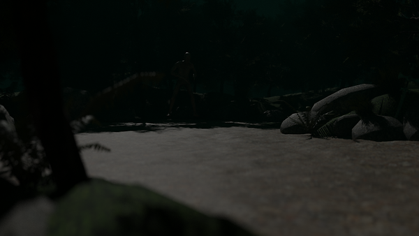
Making the environment setting


I wanted to make sure the environment didn't take long, so I downloaded a full scene off of a site called blend swap. I didn't want to copy it one for one, so I deleted everything but the rocks and ground. after doing this, I added new/ edited textures. apart from models, I have made the lighting and added fog-like effects. I'm not fully satisfied with the background in terms of volume of foliage etc. but I did plan to leave the background lacking in terms of quality to reduce render time and give me more practical time on animating.
I reconstructed the lighting as I wasn't happy with the one the environment came with. Not only that, but I also wanted a dark and moody setting. you can see how I did this by looking at the images below. it took a long time of moving the sunlight and increase/decrease the intensity. I wanted it to be really dark but it meant I couldn't see a lot of the details I have but into other things, so I upped the intensity.

Video Evidence Of Animation Process
This is me attempting my first "Proper" humanoid walk animation. I have animated with previous projects but stayed away from human walk cycles as the first time I tested doing one it went quite wrong.
as you will see in these recordings, I had quite a few issues when it came to making the walk look slightly more natural. I did use a reference image and video to help me.
I also had some help from peers, in which they would make slow-motion movements of the key "steps" in joint movement etc.
this was very helpful, and you can see throughout these clips that I have short pauses where I talk to someone or look up a reference.
Here you can see that I'm finally starting to get a walk going, I was still having issues as I was unsure of whether to move the character or the reference. I was also having issues due to the Inverse Kinematics Rig that I had made for the character just before I started animating, the rig is extremely helpful when making the knee and elbow joint movements, but the bones I used to do this will not follow the character and will have to be moved alongside the animation. furthermore, I do actually figure out how to solve this by using "child of" constraints in the bone hierarchy.
At this point, I begin to notice my previous mistakes when animating. for example, some joints would move left and right rather than forward and back, which I did not notice properly till I was previewing the animation in the scene.
this was an easy fix but it meant I had to go to every frame and correct this. normally I would be able to constrict my camera to a certain axis to stop this from happening, but the character was already half animated on a diagonal trajectory. so trying to make any big changes at this point would cause more issues than it would fix, with this I now just slightly adjusted the movements after making them.
I am now noticing the "Exaggerated" and "animated-like" movements, which I'm pretty unhappy with. this is bound to happen when making a walk animation for the first time but it really made my calm and collected character look drunk and possessed. I do try to fix this by making movements more fluid and less bouncy throughout the rest of the walk animation, but even looking at the end result, I quite dislike it. this will have to do in order to get to the "good parts" of the animation sequence, featuring the lighting and sword.
At this point, I'm done with the walk and how far I want it to go.
Now all I'm left to do is refine the movements like I was previously, but also play the animation back and forth constantly to find any fixable issues like foot sliding etc.
in order to make this better, I know I need to make the character take more steps but in smaller increments, while also giving more "life" to the upper body.
Here I am still refining by keeping the character more straight on to their destination rather than taking wider steps in width rather than length.
Planning camera angles
For this project it is basically a short film so I'm going to need to look into professional cinematic angles in order to portray my mood and give credit to where I would like it to be directed.
for the first scenes I'm using quite wide-angle shots as I want to show the situation to the audience

I am able to key frame the camera, so most of the first shots will be moving as I wish to show more of what's happening rather than having more regular camera changes. I like how this shot looks as it combines wide and over the shoulder angles. Furthermore, I wanted to use this to have the audience be on the characters' side while seeing the environment.
Lightning sections
Lightning is one of the main things in my project that's supposed to get the viewer's attention, as it's so bright and stands out from the rest.
I wish to do this well, but also make it somewhat less time-consuming as possible. also, making it more accessible so I can recycle the same asset or different times I want to use lightning.
I have used these tutorials as I wanted to explore a realistic method and a simple quick one. then combine these methods to make something in between.
This is what I have been able to recreate, I would like for this to have an origin and direction, which it kinda has but not as much as I'd like. I've currently been experimenting on the floating rocks which look good but when adding to the blade I'm unsure of how it's going to look.
this is a short look at how it's looking so far. I'm happy with this, although I wish the "fog" accentuated the lightning.
the way I animated the lightning is somewhat complicated but it makes sense.
the way I did it was by solidifying a line and allocating a noise texture. this noise texture gives the line bend and edges randomly, similar to lightning or fire. I can then move the texture using an empty. this was done by allocating the texture to the empty too, but the empty is what is able to manipulate the position of the noise texture
This is the making of one of the main scenes. I have finished it and I think it looks great. the only issue I have is "taming" the lightning. obviously, for the lightning to look good, it needs to be violent and random. this was useful with the floating rocks, as I could hide the uncontrolled parts inside the rocks.
This is so far the only model I've custom-made myself. I just needed some pebbles to add mass to the rocks floating as I wanted to make the effect of the dust and lightning
this is a failed attempt but i thought id show the process of eliminating bad ideas etc.


I'm loving how this looks but I have realized that the hand clips through the handle in the render. I didn't have this issue before as I had the camera more zoomed into the scene, with this the clipping would start out of frame, but through the production process I animated the camera moving back slightly and this is the reason you can see the clipping. I currently don't have time to fix this, so it will have to stay. I might be able to add a border effect in post-production to mask it slightly.
With this scene, I would've rather had my own katana in the scene as the design would've made sense for the lightning to be coming from
the hilt as it was designed to look like it inducts/produces electricity.
lightning doesn't stay in place, so ill need to make it appear and disappear while arcing. I have tried this but I can make objects disappear and re-appear in the render.

I then found out from a tutorial that the small camera and screen next to your assets in the asset list can be keyframes by pressing (I) when hovering over them.
this means I can now animate objects appearing and disappearing without just hiding them somewhere else in the scene. I have found this extremely useful from now on during keyframed future projects as I have struggled with this issue for a long time.

this is one of my and my peer's favourite scenes.
I just find it especially pleasing to watch, from using the different cinematography techniques I used mostly leading lines in this shot but they don't necessarily lead to anything but the direction the camera is going. it does bring a lot of focus to the effect and random movements of the displaced lightning.
I'm very happy with this scene and wouldn't change anything apart from maybe having the sword moving as well so it looks like the sword is being manipulated into the next scene.


i am coming to the end of my animation. this is one of my final scenes which is combined with the huge lightning strike. I'm not very happy with this scene as it's been heavily rushed as I've been doing 2 scenes at once in the last week. I would've like to go into some 2d software to edit the closer-up scenes featuring more effects and the slice in this scene. the reason is that I didn't have time to make a somewhat accurate "dummy" for the sword to slice. the enemy is literally just a cut in a half box at this point with a rock texture.
for the upwards slash I made sure to keep it simple as running out of time has been a reoccurring problem for most of the second half of this animation. I wanted to focus all of the character's energy on the blade at this point as to make sure the attack is one clean cut. later on, during the last scene featuring the large lightning strike, you will see that that energy is expelled all at once on the enemy leaving nothing behind.


for the end scene, I needed to make more of an environment as this is a scene showing the horizon. I panicked a little when thinking about making this with such a close deadline but found a "shortcut".
what I did was duplicate the grass section after adding hills to it. if you look closely there are 3 levels of ground. the main is the foreground. there's a dark midground behind that and then another duplicated lighter background as to add a level of depth to the environment. i honestly really like how this looks considering the amount of effort that went into making it. i did have to edit the layers slightly with a random movement tool to make the hills look less smooth because the grass level is quite smooth.
so far this animation process has been somewhat straightforward, one of the main issues was the walk cycle and making the lightning. the lightning itself makes sense to me now as it's just geometric texture displacement. the issue is when I'm trying to manipulate the lightning, it would be interesting to refine the lightning asset after the deadline as I know I can make it better. I would like to revamp this entire animation if possible when everything is finished.
Comparison to research


throughout my design process of editing the environment with new foliage and changing the lighting, I really wanted to stay close to my demon slayer inspiration as I believe this "mood" and genre really compliments the beautiful visuals of the elements used in combat like water and electricity. I feel like I have done justice to the art style of demon slayer, even when not putting full time into the background. I made sure to keep the same forested setting and volume of foliage, I even looked into trying to get the same hue of the scene featuring a low saturation and blue filter to add an element of a cold and unforgiving setting. Likewise, I did this mainly using the low lighting which took a while to perfect but I got there eventually, I also added the blue mist which got the blue hue I was looking for as I didn't want to have to add a filter in post-production.
despite the amount of effort allocated to the environment/background, I'm very happy with the way it turned out. if I had more time, I would have liked to add a wind effect to the leaves in the animation. this would give an element of life to the overall setting as it would be in real life. although I do feel like the static background makes sure to keep focus on the characters and keep the rendering time to a more minimum.


Looking back on the scenes and how they've changed


This hasn't changed much but I wanted to show more of the main character in the scene as I hadn't originally thought of downloading a character, I was going to make my own but not make a face or mask because I wouldn't have had enough time to do this originally even before the data loss. not sure if I prefer the new or old scene if I'm being honest but I like the movement of the camera in the new scene as I hadn't originally thought of camera movement between my drawn storyboards.
i had also not thought about my environment and didn't think id be downloading one online.


I didn't really want to animate the feet sliding into a stance because I thought I wouldn't be able to give justice to the boots sliding in the dirt into a stance position so I somewhat mixed scenes 2 and 3 for this part. you can see the comparison in the next scene as my ideas change quite a lot with cinematic angles compiling multiple scenes into one camera movement and adding new features.


This scene incorporates 2 angles with a sweeping camera, as you can see, the 3rd storyboard doesn't really relate too much in terms of angles but I made sure the get the floating rocks I wanted with lightning suspending them, as this is the first time seeing the lightning I love how it looks but when reusing the lightning for the next scenes. I struggled to change the size and to make sure the lightning stays where I want it to be.

I didn't have this scene on my storyboard, once watching the animation so far I felt like I needed to add some more and a peer suggested looking into the anger of the character. I like this idea and I hadn't thought of this as in my original idea I didn't have above the neck showing in any scenes.
I could've done more with this scene with the face etc, but I didn't have time.
this would've looked better if i could control the lightning more but i had to use what i had. i edited it as much as i could and in the animation you somewhat cant tell how much it clips out.


i love how this scene looks. I was perfectly happy with my storyboard so I didn't want to change anything for the scene so that's why it almost fits perfectly. the only thing I did was add a camera zooming out slightly to show more of the sword.
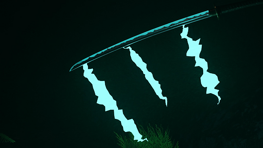
i was worried about the lightning on the blade because making the lightning smaller and thinner while keeping the "spikes" to a minimum is very time consuming, therefore I just left the lightning a bit chunkier than it should be but I still think this looks great. the thing I like the most about this scene is the reflection of the lightning on the blade. this is one of my favourite things about the entire animation really. with future scenes I made sure to make the reflections/light bouncing look as best as it can be. in pre-production I spoke about the dark atmosphere complimenting the bright lightning and I was entirely correct. I'm very happy with the decision to make the scene dark.


This is my favourite scene in the entire animation and most of my peers agree it's theirs too when watching my progress. It has got the appeal of the reflected lightning which appeared in the previous scene. but the real leading reason for why I think this scene is so nice to watch is the camerawork. I didn't look into already done techniques I just went with what I thought would be appropriate for the scene which was kind of incorporating leading lines and the rule of thirds if I did try to give a cinematographic reason for its appeal. the camera leading with the lightning really is what makes this scene look good, I feel like the jolting lightning looks like it's almost swimming its way up the blade like an aggressive animal. I will definitely use this technique in future.
I did try to have the perspective above the blade, like in my storyboard but after about an hour of trying and theorising different angles I found that my original storyboard angle is unusable as the focal length of the camera makes it so being close to the hilt/ handle really screws with the look of the scene without having a pleasing outcome as the blade just looked like a grey line from above. this is when I tried the side-on view and I'm glad I went with this angle instead as it's so much more interesting and works more functionally.

I'm not really truly happy with this scene but it's basically what I had storyboarded so its purpose is complete in a story aspect. I did make some adjustments as you can see the handle of the katana in the top right, the reasoning for this is because I did look into Japanese techniques during production and I looked into what movements look like when performing an upwards slash. this was done by leading with the hands at the highest point and leading the blade upwards.
my only real complaint about this scene is how the "lightning" looks in this scene, the reason I quote lightning is that that's what I wanted it to be and it's still meant to be lightning, but when producing this scene I'm barely on time for completing practical work and the constraints of using procedural lightning are very relevant here. it looks more like blue rocket boosters on the back of the blade which makes it look somewhat comedic which I didn't want. I did however add a glowing blade onto the texture of the blade as the emphasise the amount of power about to be released from the blade in the next moment.


This was a very rushed scene, I'm not happy with how the scene itself looks but I love the look of the lightning slicing through the cut like an afterimage. this is one of the most rushed scenes as its cut into 2 parts (which is quite funny to say), which have another scene in between, i did however edit this scene a few times as this is one of the ending scenes so I need it to look pretty good and orchestrate whats happened in the animation previously. the further into this project I realised I need to think of the project as a whole unified piece of work. not as separate parts glued together, the reason I say this is because the first time I created this scene I had forgotten the techniques I put into place with the upwards slash from the blade. this is relevant because in the first version of this I had the got going at a downwards angle and the cut was actually almost horizontal. I made sure to change this as I wanted to make these scenes flow into each other and not just cut to different practical pieces which some of the precious scenes may look like. I had also not prepared a "skin" texture for the flat object I used to represent the enemy character so it kind of looks like the enemy has turned to stone but at first glance, it is not really noticeable. I like to think from a story perspective that the first strike burned the enemy with electricity and this dark and crisped look is the result of electrical burning. I also feel like I truly started the understand my lightning and I was able to actually make it look like a bolt of electricity running through the scene which I'm glad I managed to do after messing with texture modifiers for a while.


This is the scene I really wanted to look right as this is what the whole animation builds up to. I have almost no complaints about my outcome from this scene. the only thing is I wish the lightning looked like less of an energy beam and more like my storyboard. I still think it looks great but you can almost certainly say this doesn't look like lightning if you didn't know the context. I know why this didn't work and that's because the scale of the model doesn't coincide with the scale of the texture placed onto it, this is why the jolts and zig-zags look so minor as the size of the beam overpowers the visibility of the lightning properties. however, I still appreciate how this looks with bouncing light/ shadows. I think that's really what gives this scene life and the prevalence of extraordinary energy coming from this character. the background can be somewhat overlooked as the lightning's brightness bounces off of the mist covering the scene but if you pay attention I do think it looks pretty good as it features a depth of field and the moon looks quite realistic in spite of the whole scene being made in about 20 minutes using a duplicated ground which was already there. the only new model in the scene is the moon and lightning.
I believe I could've done more with this scene, considering it's the final scene of the animation. but I really needed to get it finished. this wasn't the final scene I produced as like I said previously, this scene is combined with the cutting scene, with the lightning strike in between. I also didn't want to just end the animation on the strike of lighting. I wanted to show the results of the outcome on the character, as I previously didn't have the character's face in mind.